On looking back at my posts I realised that while I have delved upon the design, engineering & cost aspects of home design, what is missing is something around aesthetics – things like colours, lighting, spaces etc. – a very important ingredient in converting your house into a “home”
In the next few posts I will try to cover a kind of a checklist of comon sense things to take into consideration while designing your home from the perspective of pure aesthetics. This is definitely not a “must do” kind of an input as individual tastes & situations will vary, however these checklists will help provide a broad guideline while designing your own home.
I am going to break this into 4 parts (Episodes) – each around Master Bedroom, Childrens Room, Living Room & Kitchen. The first one below is on designing the Master Bedroom
A small disclaimer before I start – I am no expert at Vaastu and will not even attempt to sound intelligent on the august subject, what follows below is just Home Design Common Sense.
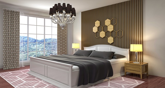
1. Head of the bed should not be under the Window – you don’t get head rest space that is used for both comfort & decor (e.g. highlighting the wall around the head rest or putting a large family photograph there) + the cold breeze on your head in winter is ingredient for illness.
2. Align the length of the bed to the longer edge of the room – this gives better space utilization
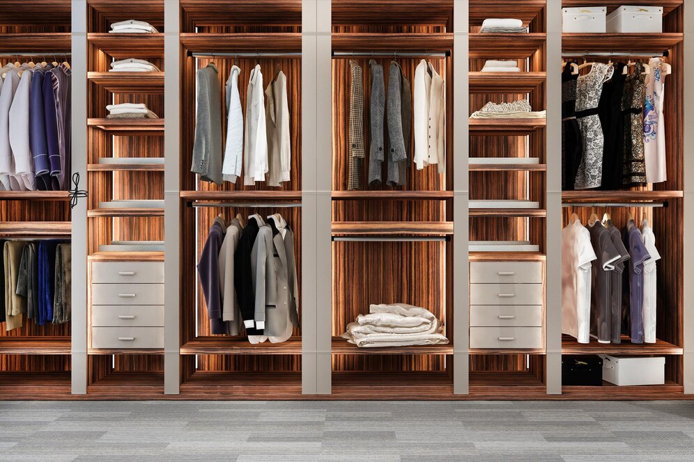
3. Align the wardrobe (especially if long) to the longer edge of the bedroom.
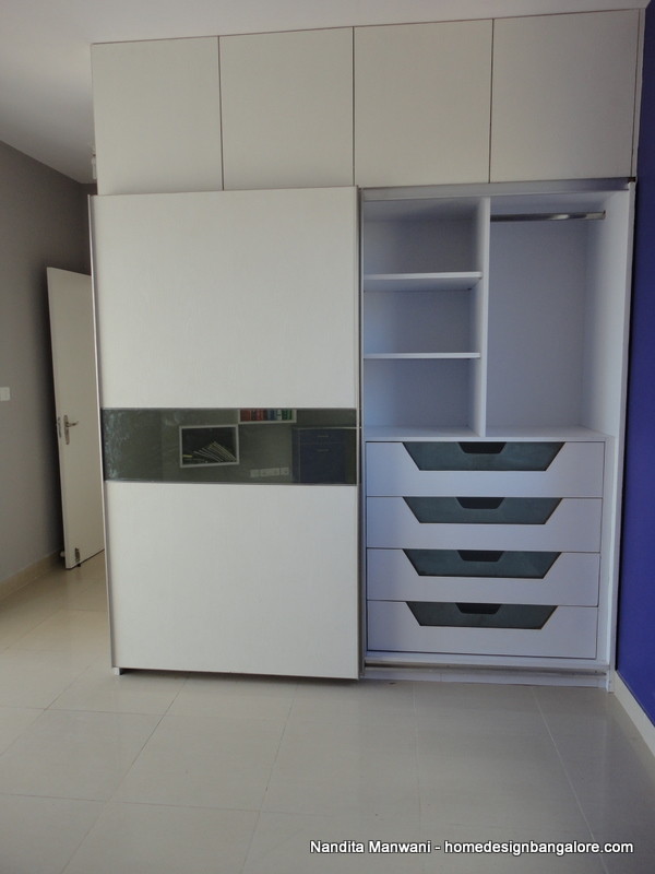
4. In small size rooms go in for a sliding wardrobe
5. Bed should not be placed in front of the door (entrance). Leads to lack of privacy as well as blocks the view as when you see inside the room from outside…makes it look cluttered
6. For the same reason as above don’t make the wall facing the entrance very heavy – in terms of both colour or woodwork.
7. Don’t have heavy woodwork on both sides of the bed – makes the room claustrophobic
8. Don’t extend the loft above the bedroom entrance – makes the room look boxy when seen from outside
9 For small rooms look at the possibility of reducing the depth of the Wardrobes. Use parallel coat hangers – along the face of the wardrobe (coat breadth is usually the constraint when designing wardrobes).
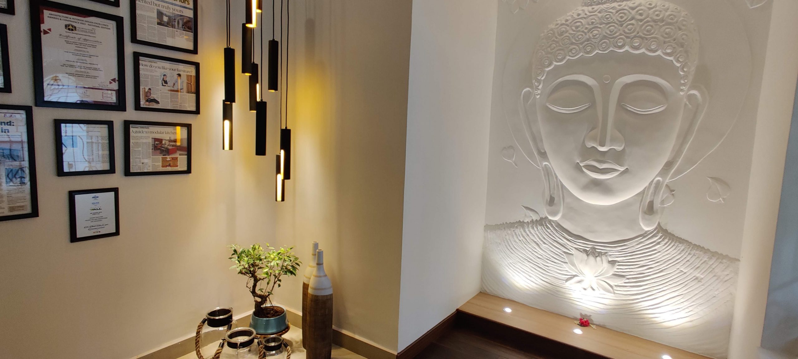
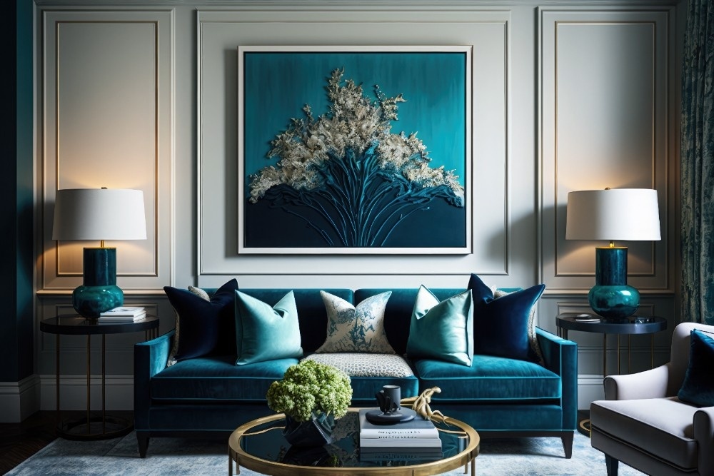
10. Use soothing colours in the bedroom. You can however highlight the wall that has the headrest with a brighter colour or textures.
11. Preferably use yellow lighting in the bedroom.
Thats all I can think of right now. Look forward to Episode 2 on Kitchens in the next post.
Signing off
Nandita



















2 thoughts on “Home Interior Vaastu Shastra – Episode One – Master Bedroom”
Hi Nandita
your blog is so informative and thanks a ton for sharing your knowledge in the area of interior designing.
Specifically this series of BKM (best known methods) of room designing is absolutely great.
Did you ever get a chance to write on living room and kids bedroom?
I could find only episode 1 and episode 2. Please point me to the link if i am missing something.
Rgds
Sumitha
very informative blogs