In one of my earlier posts, I have talked about the importance of bringing together the 5 core elements of Interior Design – Namely the Furniture, Furnishing, Lighting, Colour & Décor and how good Interior designers are able to bring these 5 elements in harmony with the sixth element – the Lifestyle and Life-stage of the family to curate fine living spaces.
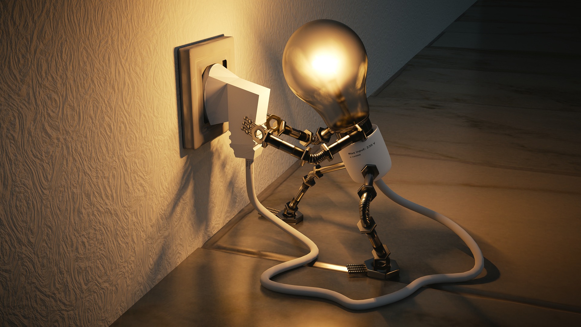
Today I want to focus on the core element of Lighting, an element that is often neglected, or not planned well in most home design projects. The lighting discussion gets limited to the look of the light fitting and the wattage of the lamps – while these are important for ensuring “Visibility”, they fall far short in creating an Ambience. Creating an ambience is the fundamental aim of Lighting Design for Spaces – Hold that thought as we will be coming back to it in a few minutes.
The Basics First – Wattage, Lumens, and Lux
When you pass electric energy through a filament it produces light. The more energy (Watts) you pass, the brighter the filament grows. This discovery in Thomas Edison’s Lab set up the basis of measuring light in Watts (a unit of energy) – a measurement unit which is fundamentally flawed and has nothing to do with measuring the ACTUAL intensity of the light – for example LED Light of 15 Watts burns brighter than an incandescent lamp of 60 Watts.
In 1894 Andrei Blondel of France introduced a measure of Actual brightness called Lumens – it is like a shade card of hair dye where each level of brightness of light has a certain code, or a number assigned to it. Now all women know that Burgundy 881 is lighter than Jet Black 990, similarly all scientists know that a bulb with a Lumens rating of 1000 will be brighter than one with a rating of 500 no matter what is burning up inside and at what wattage. A 60-watt incandescent bulb produces approximately 800 Lumens of Light – this can be used as a general frame of reference for understanding and comparison.
Now let’s start playing with this 800 Lumens Bulb. If you place it in a room of 100 sqft it will feel nice and bright, now put the same bulb in a room of 1000 sqft and you will start groping for a light – this brings out the concept of Illuminance or a Lux Rating (don’t confuse this with the Soap bar). While Lumens measures the brightness of a bulb, Lux measures the brightness of a Space. All those Meters that you see in the hands of photographers are basically Lux Meters.
The interesting part is that Lighting Planning demands the brightness of spaces NOT be distributed evenly – if you evenly distribute the Lux then the space will feel boring, … like a terrace restaurant in daytime, and you don’t want that. Lighting for Ambience (remember we said we will come back to this) is really the art of managing the Darkness. Let me give you an example – if you want to make a space feel intimate or private – like a table in a luxury restaurant, a small bar counter at home or a cozy corner in a residence then have low lighting in the focus area surrounded by a darker area at the periphery. Wash the same space with direct lighting from the top and it will start to feel intense – you must have seen in the movies that interrogation chambers always have direct & bright lighting from the top.
What this also tells you that Ambience created by Lighting goes beyond just the aesthetic (how the space it looks) but it fundamentally determines the personality of the space and how people perceive it, feel in it and how they ultimately behave in it.
Lighting Colour – The Hot and the Cool things about Lighting
Now that we have proven that Lighting is “Cool” in the colloquial sense of the word, we will discuss why when it comes to Lighting the Cool is also Hot, I will tell you what that means in a bit and for that you need to walk up to the nearest shopping mall.
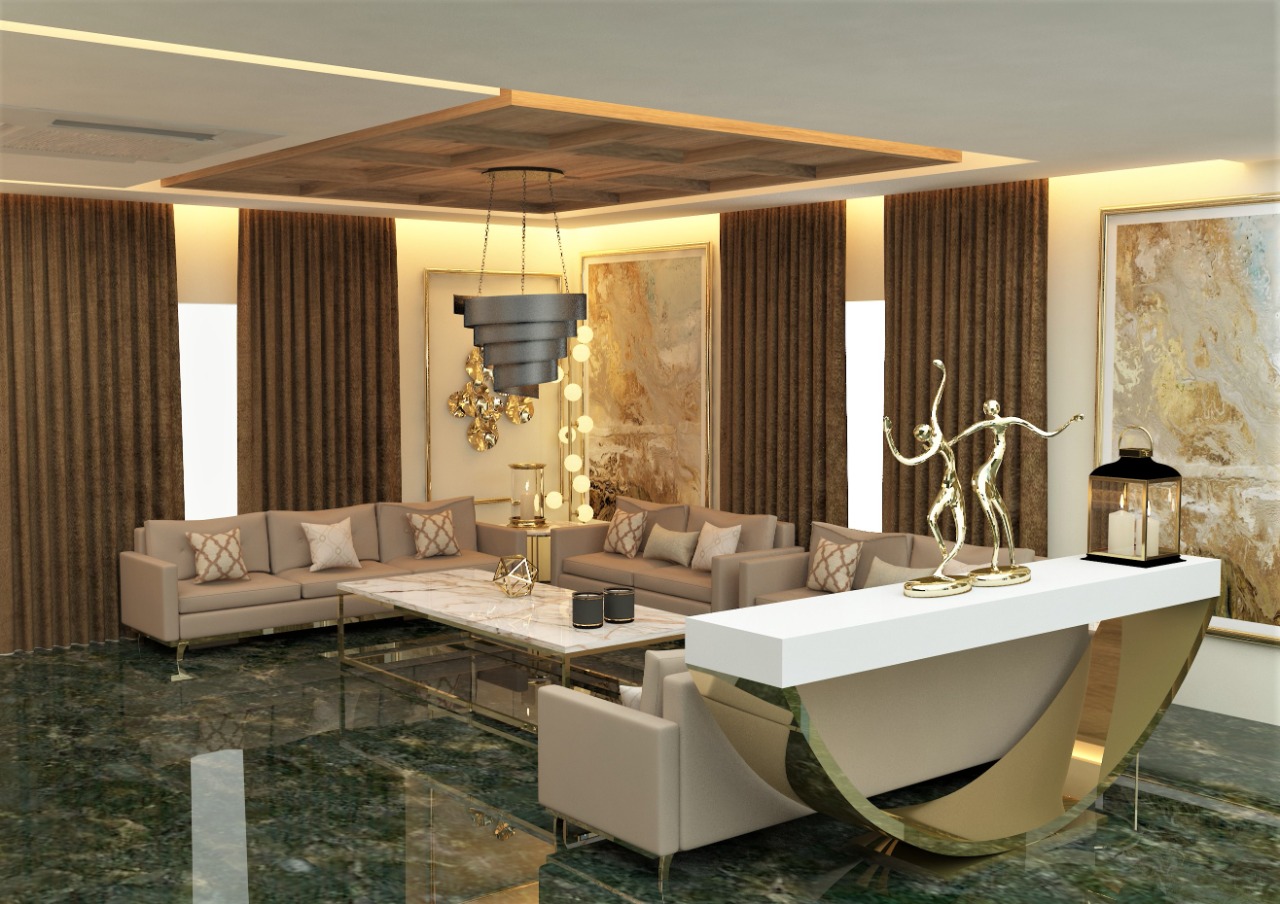
When there, look for the most luxurious looking store or a store that sells expensive products, notice the colour of the lighting – I can bet it will be golden yellow. Now walk down to the Supermarket in the basement – the Spar Supermarket, Big Bazaar or whatever and notice the colour of the lighting – I bet it is white. Now wasn’t that really really cool? In lighting design terminology White Lighting is a Cool Colour while Golden Yellow is a Warm Colour. What we noted here is that Warm Lighting gives Space a feel of Luxury and Cool Lighting gives it a sense of Efficiency.
Technically speaking, Lighting Colour is determined by something called a CCT Rating (Correlated Colour Temperature). If the CCT of a light source is 10000K it means that it glows in a colour that is the same as that of a Black Body heated to 10000 Degree Kelvin (373 Kelvin = 100 Degree Celsius). The Image below shows the colour of light against its CCT Rating in Kelvin (K)
CCT Rating & Light Colour
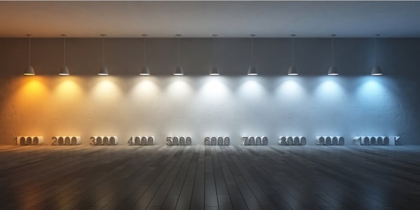
Interestingly, rather confusingly, you will notice that the colour produced by applying 1000 Kelvin to the Black Body – see the Golden Yellow in the image above, is technically called a Warm Colour while the one Produced at the much hotter 6000 Kelvin – the White Colour in the Image is called a Cool Colour. Which is what I meant it when I said earlier that when it comes to Lighting, the Cool is actually Hot
Light Colour & Nomenclature
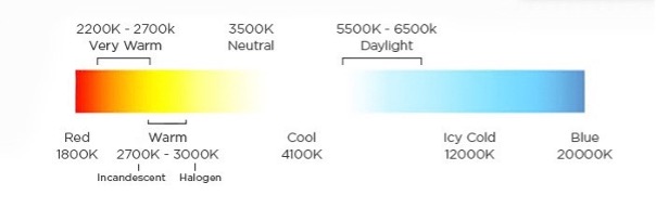
To see this practically we will go back to the Supermarket – now navigate to the electrical section and look for LED bulbs and find one that says Warm White and another that says Cool Daylight. It’s the Warm White Bulbs that are installed in the Luxury Store and the Cool Daylight ones in the Supermarket.
For most Residential applications the CCT should range between 2700 to 4500 with the following distribution
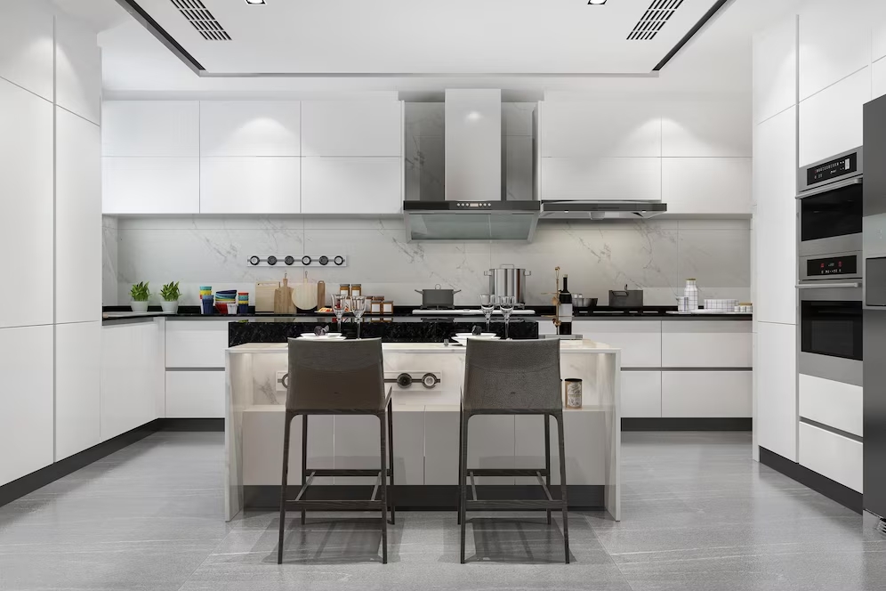
- Study & Work Rooms including the Kitchen: Closer to 4000 – This helps with long periods of Concentration & Work
- Living Room, Bar: Closer to 2700 – Helps with creating a relaxed environment
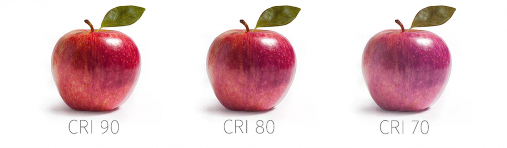
There is another independent metric for lighting that determines how clean is the light that the bulb generates – it is called a Colour Rendering Index or the CRI Rating, it measures how objects render (are seen) under artificial light versus Natural Light. A CRI of 100 means that objects will render the same way as under natural light. As a rule of thumb, a CRI below 80 is not recommended. A Kitchen Backsplash lit with an LED of CRI 90 will look far more attractive compared to one lit with a CRI of 80. Luxury Stores, Hotels and Art Museums will always use Lights with a CRI of over 95. You might have often wondered why one LED Light costs so much more than a similar one from a different brand – the difference is due to its CRI Rating The image below is that of an apple and how it will show under a light source having a CRI of 70, 80 & 90.
________________________________
If you have been reading this article with concentration sitting in a room that is sufficiently illuminated at 800 Lux, a CCT of 4000 and a CRI of 85 then you would ask – what if I use my living room to read and then later want to use the same space for a nice and warm get together with friends. Will I not need different Lighting Design for the Same Room? This is exactly where Layering of Light and Lighting Scene Planning Comes in.
Layering of Light & Scene Planning – The Club Sandwich Analogy
I love a Club Sandwich and it is often my favourite dish on the Menu. Maybe I am also getting these foodie analogies because its lunch time and I am hungry – see the picture below and you will feel hungry too 😛

Anyhow, if you see a club sandwich, it has multiple layers of food – each different and contributing a separate taste, texture and flavour to the sandwich and ultimately giving the sandwich its own unique taste. In a similar way lighting of spaces is done in multiple layers, each layer performing a different function and all the layers coming together to create a unique ambience. Given below are the 3 layers of Lighting
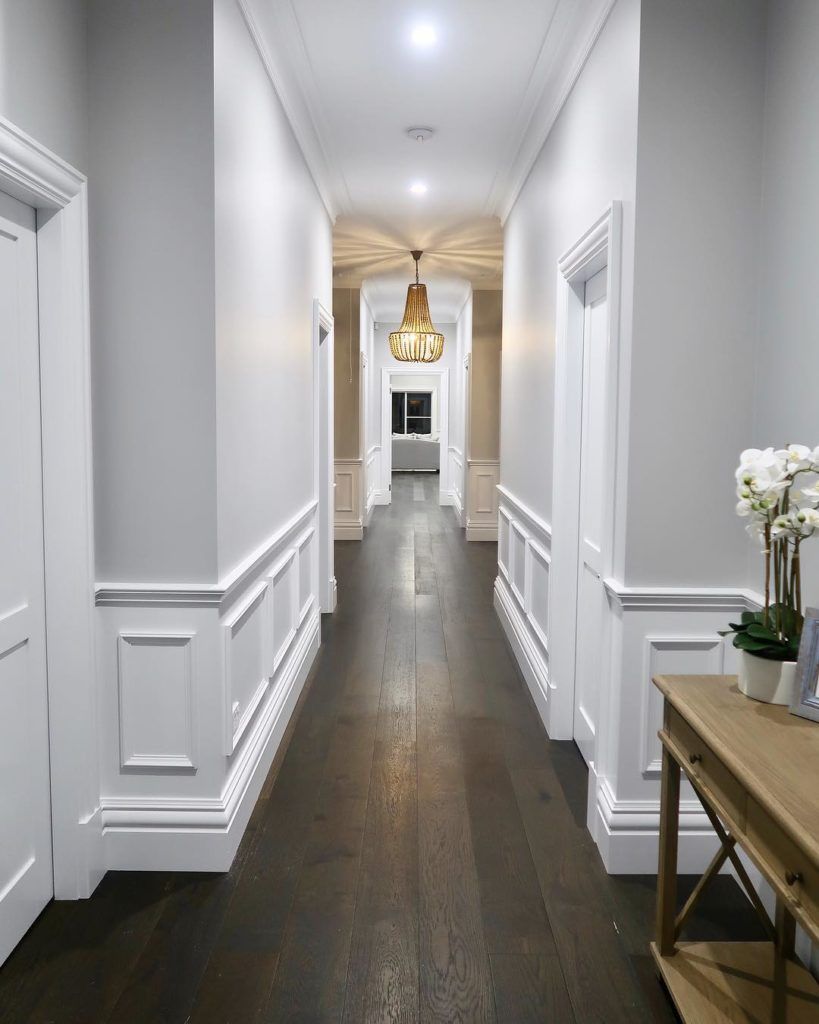
- Ambient Lighting: This is the umbrella layer of Lighting. It provides general illumination for people to see, walk around etc. This could be through an Open Window, a Chandelier, Wall Lamps, Pendant Lights, Spotlights or Cove Lights
- Task Lighting: These are lights that aid with performance of a particular work task – such as downlights over a Dining Table, A Kitchen Counter, a Work Top or a Study Table
- Accent Lighting: These lights are for highlighting any specific area or an object – Lights over a Painting or a Mural, light strips behind a TV Panel etc would classify as Accent Lights.
Good lighting design demands that each of the 3 layers are planned such that they can be controlled individually and that their intensity levels and colour tones complement each other to create a unique ambience at different times based on the passage of the Sun.
With dimming controls available nowadays both the intensity and the colour of the lights can be independently controlled at variable levels to create specific lighting scenarios that go along with a particular mood or activity such as listening to music, movie time, reading, party, exercise etc. Smart Lighting technology is cheap nowadays and it allows these scenarios to be set up, stored and replicated when required.
There are other constituents of Lighting Design such as Managing Shadows, Downlighting versus Up-lighting, Angle of Placement, Usable Lumens, Cone Angles etc. that we will not get into today to avoid the risk of making this into an academic lecture. Also, the design components described above should be sufficient for most Home Lighting Design Projects.
Signing Off for now and as always, shall appreciate your comments and inputs
Nandita
Nandita Manwani is a Leading Interior Designer in Bangalore and the founder of The Studio by Nandita Manwani