The thought and the topic of this post came up during a recent drive to Ooty with my sister’s family. On a sharp turn the car felt as if it would not straighten up, kind of steering on its own & my husband (an automobile engineer by training) commented “Cars that are designed well do not over-steer & this one isn’t (…designed well)”. Don’t expect me to explain what that means as my expertise in automobile engineering is limited to being able to telephone Zakir the mechanic whenever the tyres feel plumpy or the bonnet smoky.
Driving with two men who shared common interest on the subject of Cars, the discussion did move further to things that go into hi end automobile design. Here are a few that I learnt – In hi end cars all the 4 wheels turn when you turn the steering to optimize the car’s turning movement, in some the lights too turn with the steering, some have programmable seating that optimizes your driving position based on your body structure. “Some manufacturers spend considerable time, money and effort just to optimize the interiors of the vehicle and ensure right storage in the right places – ever noticed the space for sunglasses in a Honda, right under the rear view mirror … perfect” said my brother-in-law excitedly. “I do that too when I design my kitchens & my homes” I say…..and that was the moment when it dawned.
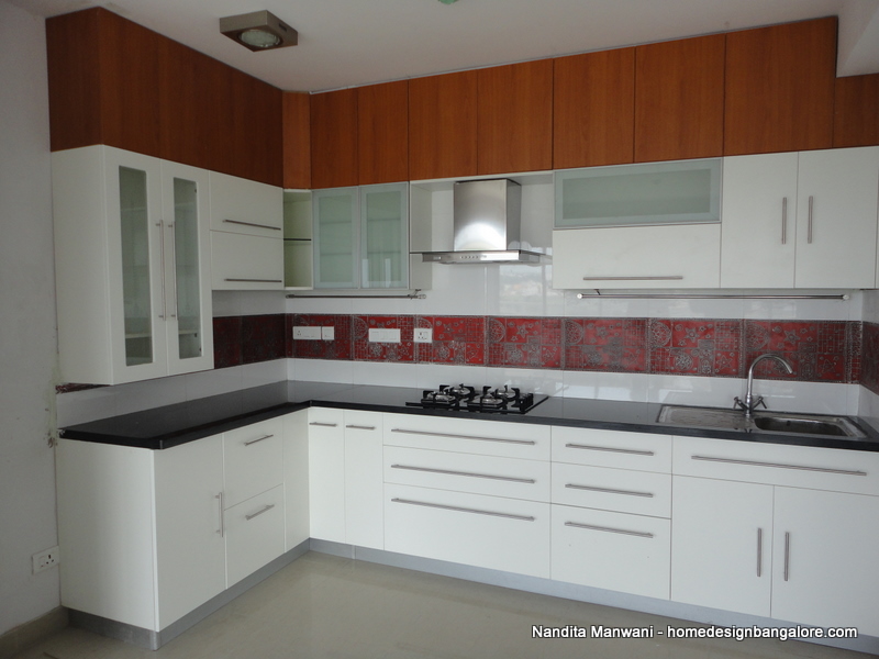
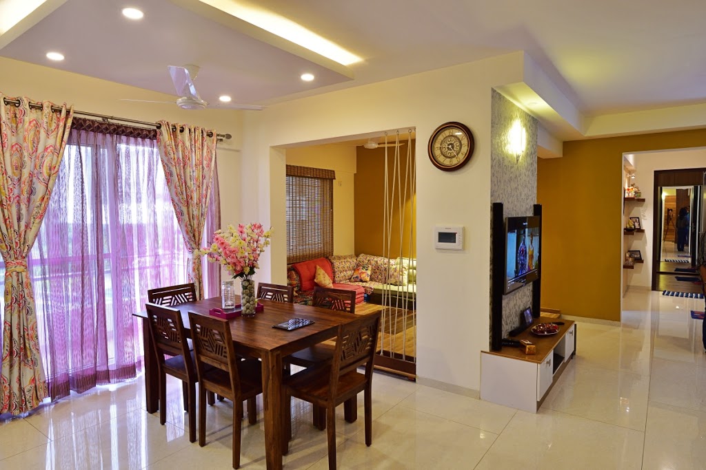
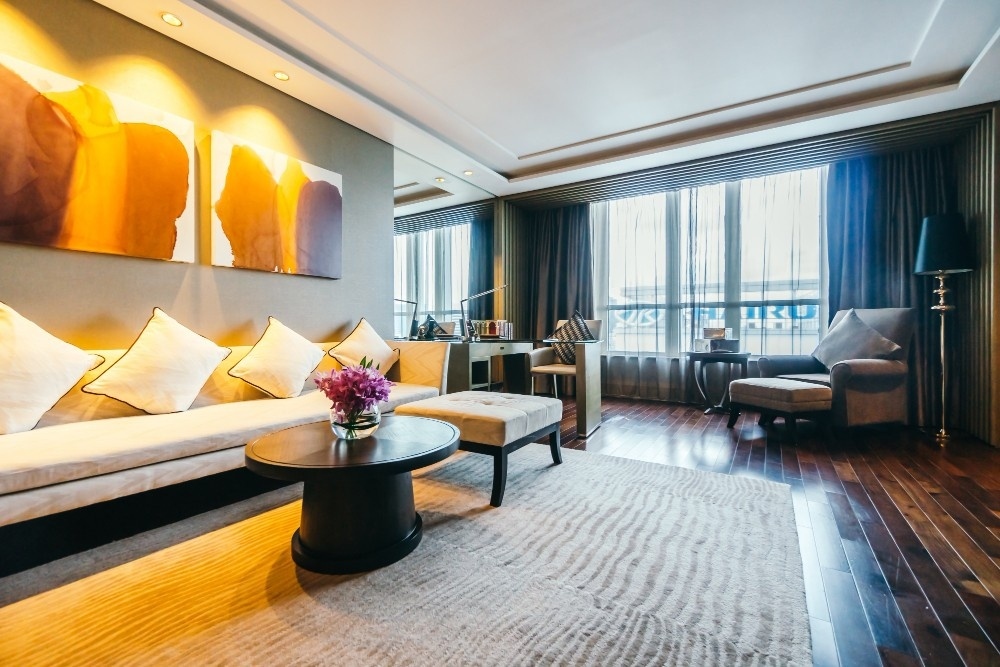
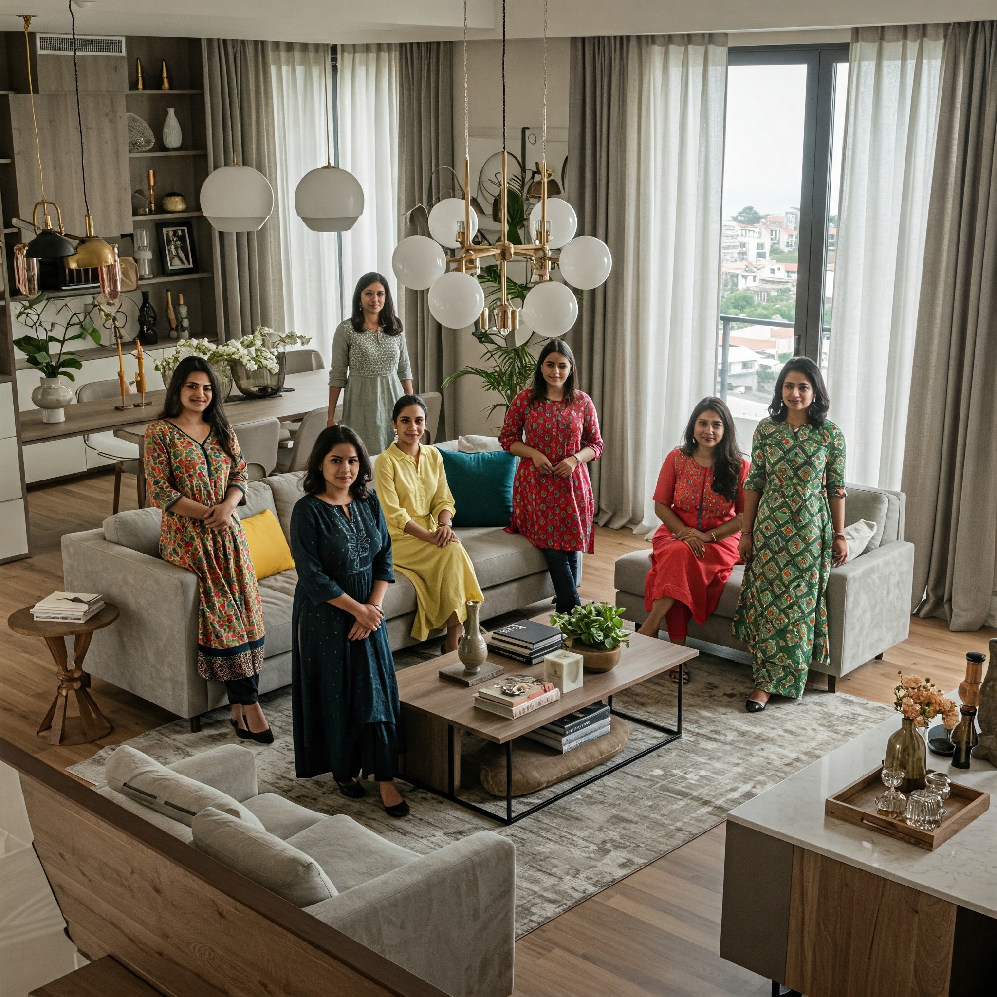
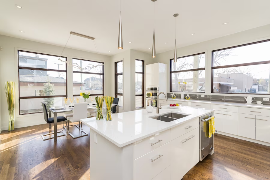
A well designed home is EXACTLY like a well designed car – you just know it when you drive/ walk into one, you may not be able to pin point specifically what the difference is but while the car feels great when you drive it, the home just feels “nice” when you enter. I remember this interesting episode of a customer who commented “you know whenever the neighbors come in they say that my home somehow feels different and more balanced” – in that project we had changed the position of the fans in the drawing room to go with the symmetry of the overall interiors of the room. And it does not stop there – things like aligning the tile lines (the lines made by the floor tiles) throughout the house as they enter from the living room to the bedroom, from the corridor back into the bedroom, like deciding whether the shutter flap will be a pull up or a pull down, the drawers will be to the right of the kitchen hob, the left or right under. All these things and more is what I believe to be the “Design” element in
Interior Designand it is especially important when doing “
Home”Interiors because a Home needs not just to look good but also be
built SPECIFICto your lifestyle & needs (Commercial interiors mostly need to look good & that’s it).
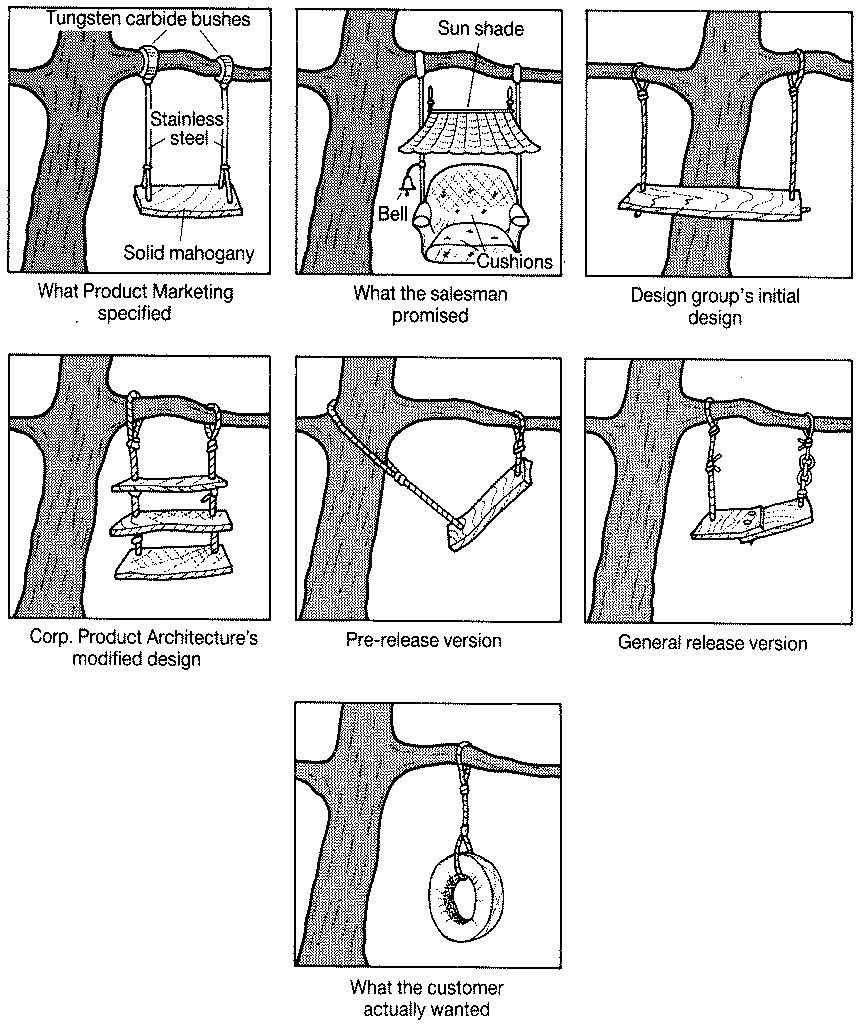
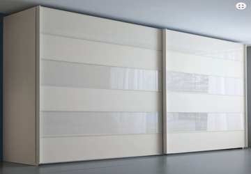
The other aspect to consider while thinking of the Design element in Home Design is around “Visualization & Designing to BUILD”. Some of you who have walked this path would have experienced this when you designed something, and when the carpenter delivered, it looked something entirely different
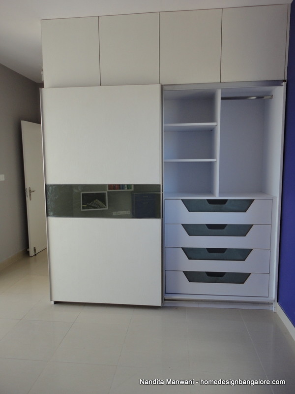
“Bhaiya, see there is this small gap in the shutters when they close” – Possibly because the thickness of the shutter that the carpenter kept was more than what the hinges he used could handle.
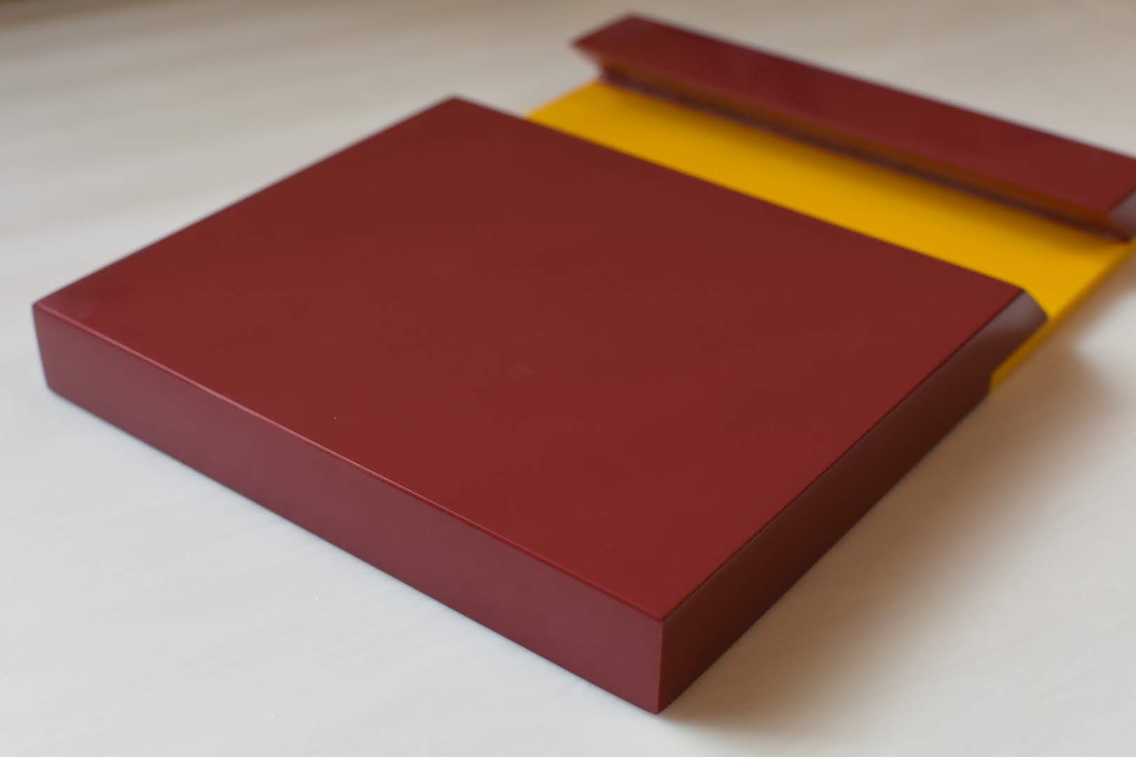
“This line I see in the front – where did this come from” – Because “Bhaiya” made the shutter Inlay while you designed it Overlay.
“When I look from the side, the shutter looks odd on top of the carcass” Because he made the shutters OVERlay while you designed it INlay
If you are a techie then picture the image on the top
Don’t worry – this happens even to the best designers in the field. The point I am trying to make, which you would have guessed, is that the Design needs to incorporate the limitations of both the hardware and the workman. While the limitations of the workman can be managed with over-communication or by getting a new workman, it is extremely important to know the material & HARDWARE that will bring your design to life. With the HUGE Hardware range that’s available in the market today — Hinges – butt, piano, inlay, overlay, half overlay… Sliding Systems – Top Line, Slide Line, Wing Line, Inset, Overlay etc.etc. & the Hettich Hardware Manual running into some 1560 pages, this is one research that one HAS TO do before embarking on a design journey.
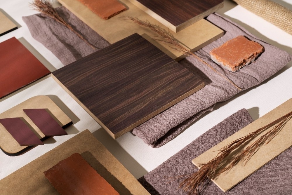
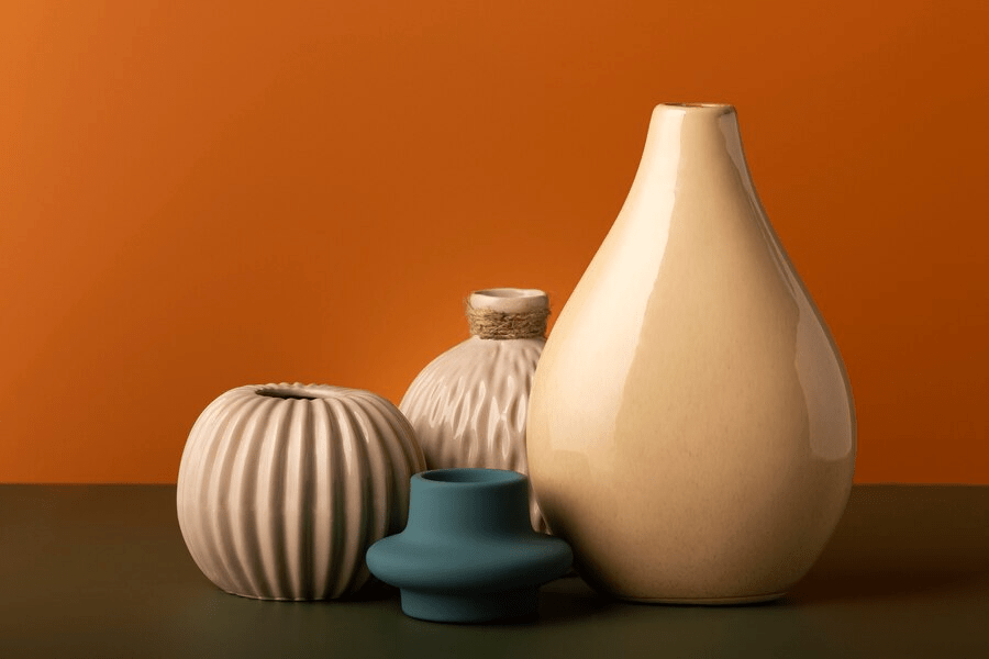
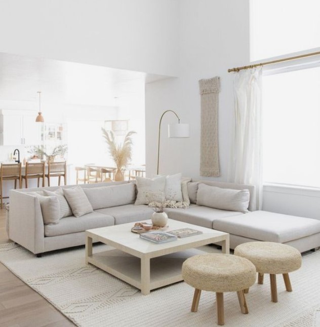
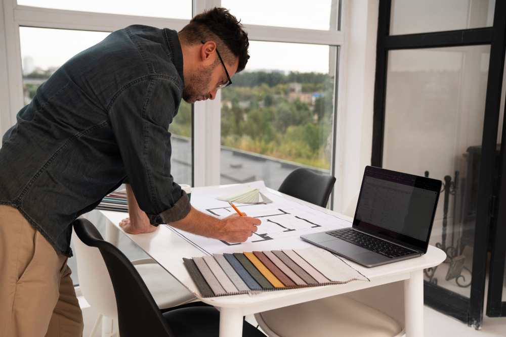
Colours & Lighting add an interesting dimension to the “design element” as well which is perhaps the most under-rated & under thought. An extremely well designed home can look ordinary if the colour selection & lighting is not done properly and a fairly simple home can look extraordinary with the right colour selection & lighting. While choosing colours bear in mind how you want the room to look – warm, bright, spacious, ethnic or contemporary – once done, choose colours of the walls, textures, furniture, furnishings that complement that requirement – the colours themselves could actually contrast & this part in my view is more “art” than technique. There are some apps available nowadays that help you play around with different colour selections for interiors…look these up.
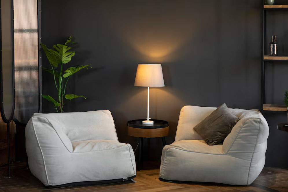
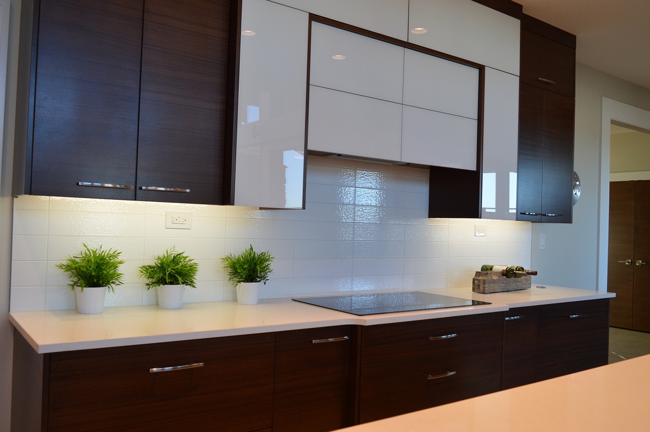
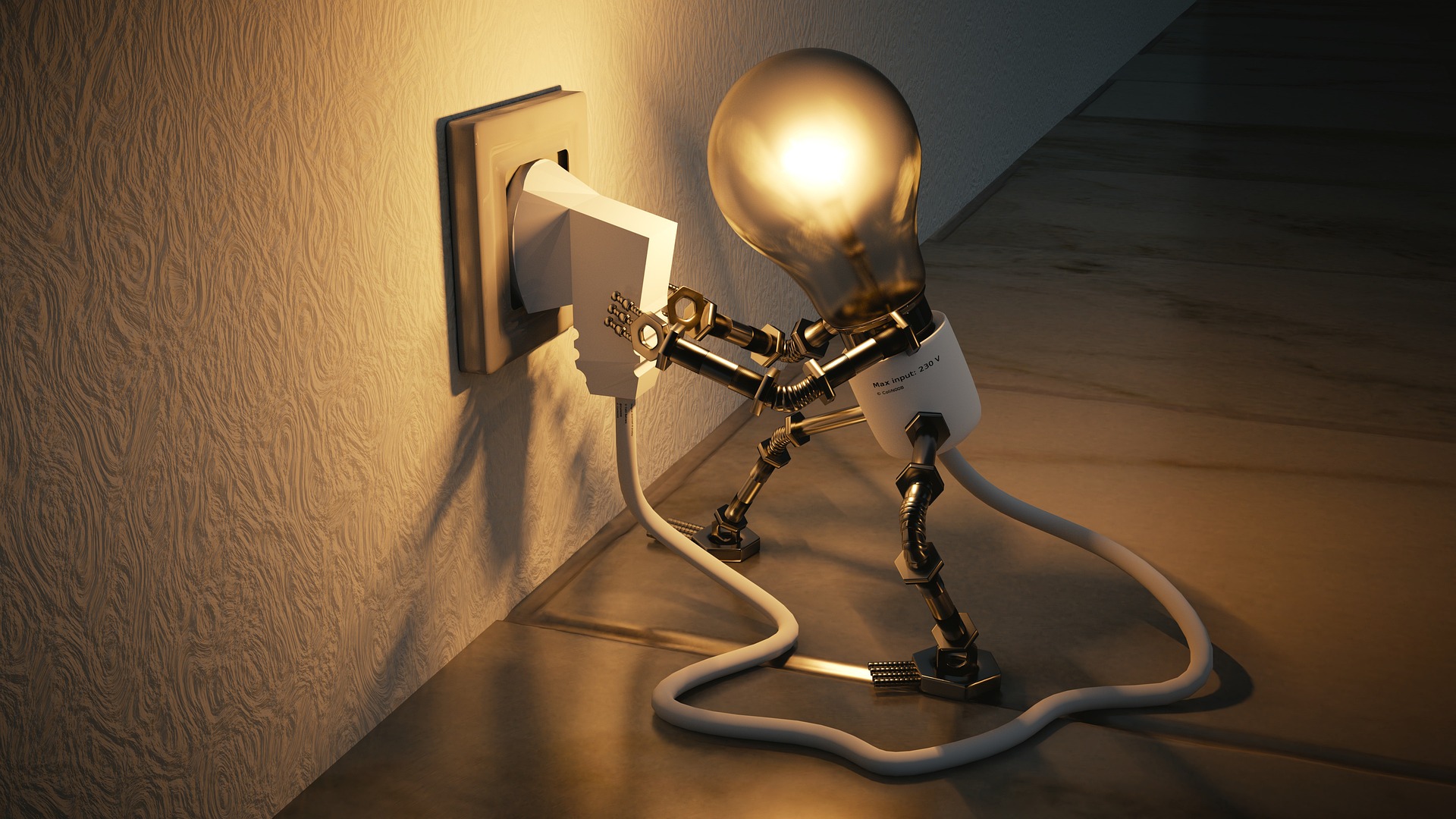
Lighting on the other hand is a unique design element. Did you know that the a simple spotlight with an LED will give a completely different effect compared to the same spotlight with a CFL? Same applies to yellow lighting versus white lighting. A painting or a highlighted wall lit from the top will give a different look compared to one lit from the bottom?. I recently purchased a basic LED rope from 2 different vendors/ brands & noticed that the effect of one was much warmer that the other…just goes in to prove that there is really no end to learning in this field. A good amount of time spent in a lighting showroom will hence stand one in good stead when planning your home interiors.
Well I hope that I have not ended up confusing you than clarifying and will look forward to your comments and feedback…as always Happy Homemaking

















1 thought on “A Car is not “Just” a Car – The element of “Design” in Interior Design”
Hi Nandita,
Yes, great analogy using the auto interior as an example since it's something where it's a bit easier to discern poor design. Sadly rather than being built around the driver/passengers, autos are designed from the outside in, so the designers specifically tasked with interior are left to work amid many constraints.
Similarly, as you can attest, home design follows the most efficient building method so we're left with homes that aren't quite right, but outside of intensively used rooms such as the kitchen, most people are unable to pinpoint what is off. I'm glad you mentioned lighting…I think it's one of the most important design features, yet it's almost always overlooked. I think that's for two reasons, people tend to only think of lighting as a functional element so they're unaware of both it's design and atmospheric aesthetics.